Here's a quick example of what it can do:
We headed back from a dropoff in New York this morning. It also shows the metars and tafs, and color-codes the reporting stations so we can get a good idea of what the weather is like at a glance.
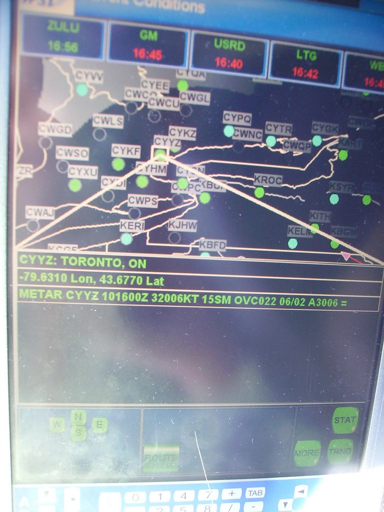
The little red triangle is us, and the red line behind it is our path, heading back from Teterboro.
Blue = good
Green = okay, marginal vfr
Yellow = not so good, we'll prolly have to do an approach
Red = Cat 1 ILS minimums
Pink = Below Cat 1 ILS mins
It also shows satellite radar and lightning, in addition to a whole pile of cool other things, like pireps, upper winds, and surface winds.

I can tap on the screen and bring up the metars and tafs for any place that reports weather in North America. Here we see Toronto, which has an overcast layer well above our approach minimums, so I know in advance it should be a smooth approach.
You'll notice that the dot on Toronto is Green, which means the weather is decent, but not totally clear. The dots nearby that are blue indicate that the weather there is even better than in Toronto.
You can see the little red triangle that is us on the bottom right corner of the pic.
Now we pan a little further west to check out an area of bad weather. The tablet PC shows us satellite radar with a range that stretches well beyond the capability of our aircraft - we have decent weather radar to about 200 miles, but with this, I can see radar in California if I choose.
Click on the pic to make it bigger. You'll see an area of precipitation with green, yellow and red shades, which changes to blue at the top. The blue indicates frozen precip such as snow and ice pellets, and the green, yellow and red indicate unfrozen precip, such as rain.
In this case, there is a storm system well west of us that is partly rain and partly snow.
Now if you notice, you'll see a pink box just to the left of the green/yellow/red radar image, around the cities marked KALO and KIUN That's a graphical representation of a SIGMET report, which is a report of hazardous weather. It looks like the SIGMET report has lagged a little, as the radar shows the heaviest precipitation just in front of the box.
Now one other thing to note (and you'll have to zoom in on the pic) is just south of KBDQ and where it says Sigmet 8C, and also south-west of the pink SIGMET box, you'll see about 4 white dots. Those are lightning strikes, so we know this is a storm system to be avoided.
If I'm flying along and I see an area of heavy precip, it might just be rain, but if I see the white dots in it that indicate lightning, then I know it's bad-ass and I will have nothing to do with it.
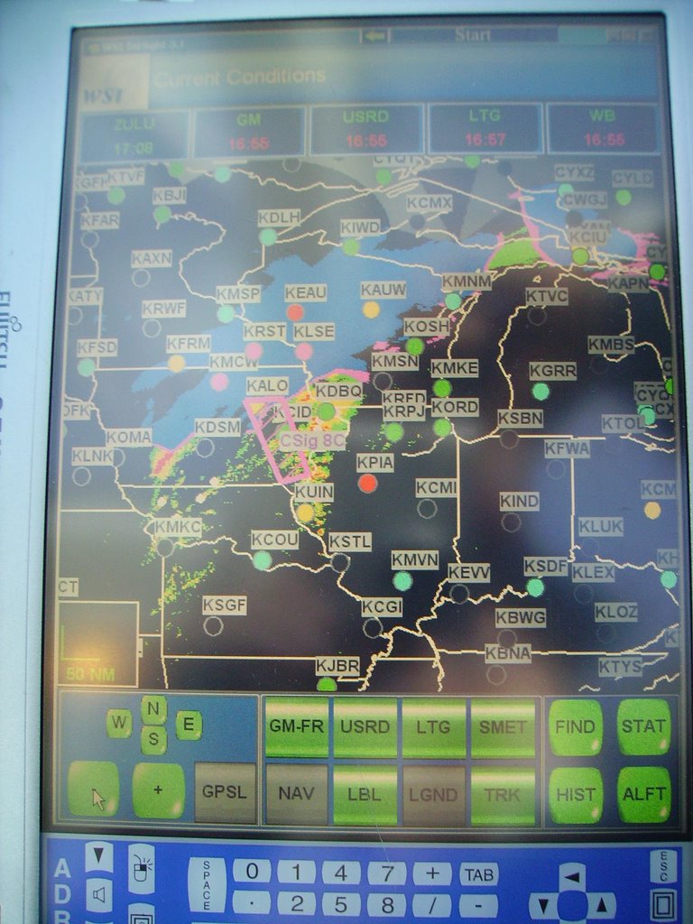
Now if I tap on the SIGMET box, it will bring up a field that lists exactly what the sigmet is. In this case, it talks about an area of thunderstorms moving from the west at about 40 miles an hour. The tops of the thunderstorms are at around 40,000 feet, but most of the tops are below 35,000 feet. In this case it's possible that we could climb above the entire weather system and fly over it with no harm, so if I was headed in that direction, I'd consider that option instead of diverting around it.

This system cost $15,000 installed, and it's worth it's weight in gold. For a relatively low cost, I have instant access to all the weather across North America. So when we depart the Bahamas for a 4 hour flight to Toronto, I can monitor the weather in Toronto frequently, and if I see storm systems moving in, or fog, or whatever, I can plan my course of action well in advance.
I really can't say enough good things about it.
This is the second function of our tablet PC, it will display a Jepp approach chart and then the GPS will overlay our aircraft position on it. It's awesome as a backup to make sure we are in the general vicinity of where we should be. If I'm in an unfamiliar airport I can also bring up the airport diagram and it'll show our position on the field, so I can make sure I'm taxiing in the right direction.
Turn off the sound, it's staticky as hell.
In this clip, we are crossing over Toronto, heading for a downwind left for an ILS approach onto Runway 5. You'll notice the computer draws a line ahead of the aircraft that predicts our track across the ground. This is very useful to see where exactly we are going to cross our final approach course.
We don't use this as a primary instrument, our ILS navigation system is still the #1 thing we refer to, but as you can see, it is a great backup to give us situational awareness and a graphical representation of exactly where the airplane is with reference to the airport.
Here's the last 6 minutes of my flight into Pearson yesterday morning. Turn off the sound.
No comments:
Post a Comment